為何AI持續生成相同的紫色漸層網站
文章探討了「AI 雜訊」現象,即 AI 生成的設計高度相似,常出現紫色漸層。這歸因於大型語言模型(LLM)作為統計模式匹配器,透過網路上大量的程式碼進行訓練,其中像 Tailwind CSS 這類熱門框架的單一預設顏色選擇,在統計上變得極為普遍。
🌻 prg.sh
Search
Explorer
❯
❯
Why Your AI Keeps Building the Same Purple Gradient Website
Oct 26, 202512 min read
In August 2025, Adam Wathan posted an apology on X that got over 1 million views. He apologized for making every button in Tailwind UI use bg-indigo-500 five years ago, which caused every AI-generated interface on Earth to turn purple.
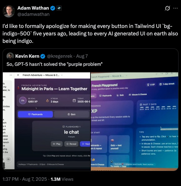
He wasn’t joking. There’s now a documented phenomenon called “AI slop” where AI-generated designs are instantly recognizable. Purple gradients. Inter font. Three boxes with icons arranged in a grid. Timid color palettes. The same layout, over and over, like a cargo cult reenactment of what modern web design looked like in 2020.
LLMs are excellent at generating code, but they’re not designers, they’re statistical pattern matchers. When you ask Claude or GPT-5 to “build a landing page” without specific constraints, you’re not getting design. You’re getting the median of every Tailwind CSS tutorial scraped from GitHub between 2019 and 2024.
And that median is purple.
How Purple Became the Default
The Tailwind purple story is a perfect case study in how training data shapes LLM behavior.
When Tailwind CSS launched its component library five years ago, the team needed a default color for demos. They picked bg-indigo-500. Not because it was particularly special, but because it needed to be something, and indigo was neutral enough to work across examples.
That single choice saturated the web. Thousands of developers copied those examples. Thousands of tutorials used those defaults. When LLMs trained on code scraped from the internet, they learned an implicit rule: “modern web design = purple buttons.”
Now, when you prompt an LLM to build a UI, it reaches for purple. Not because purple is objectively good. Because purple is statistically common in the training corpus.
The same pattern repeats across every design dimension:
These aren’t bad choices. They’re just boring. Safe. Predictable. The design equivalent of plain oatmeal.
What AI Slop Actually Looks Like
If you’ve generated frontends with LLMs, you’ve seen this before:
The hallmarks of AI slop:
What’s usually missing:
The Functional Gap
The functional problems matter more than the aesthetic ones. An LLM will generate a contact form with no validation, no error states, no indication of which fields are required. It looks like a form, but it doesn’t work like a form a human designer would build.
Why? Because LLMs are trained on static code, not interactive behavior. They’ve seen thousands of form HTML structures, but they haven’t experienced the user flow of actually filling one out and hitting an error.
The Anthropic Cookbook Solution
The Anthropic team documented this problem in their cookbook, and their solution is surprisingly straightforward: give the model explicit design constraints.
Three strategies work:
- Guide specific design dimensions
Don’t ask for “a nice-looking page.” That’s ambiguous. The model fills ambiguity with averages.
Instead, direct attention to individual elements:
- Reference design inspirations
LLMs trained on text can’t visualize Dribbble mockups, but they can reason about design aesthetics if you describe them.
Try prompts like:
This gives the model a target that isn’t just “the average website.” You’re asking it to interpolate between training examples that share a specific aesthetic thread.
- Explicitly call out defaults to avoid
Tell the model what not to do:
This works because transformer models can perform negation during inference. You’re explicitly reducing the probability weight of the patterns you want to avoid.
The Distilled Aesthetics Prompt
The Anthropic cookbook provides a comprehensive system prompt that addresses all four design areas:
This prompt does two things: it provides positive guidance (what to aim for) and explicit prohibitions (what to avoid). Both matter.
Here are the results of UI generations both with and without the prompt section above.
Without guidance, Claude often defaults to simplistic designs with white and purple backgrounds. With the aesthetics prompt, it produces more varied and visually interesting designs.
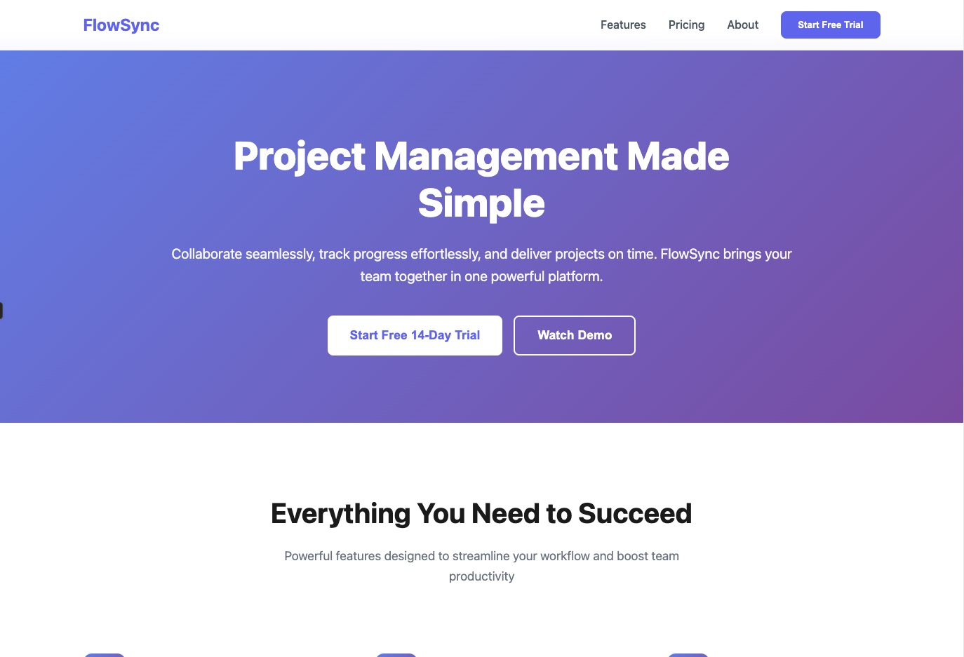
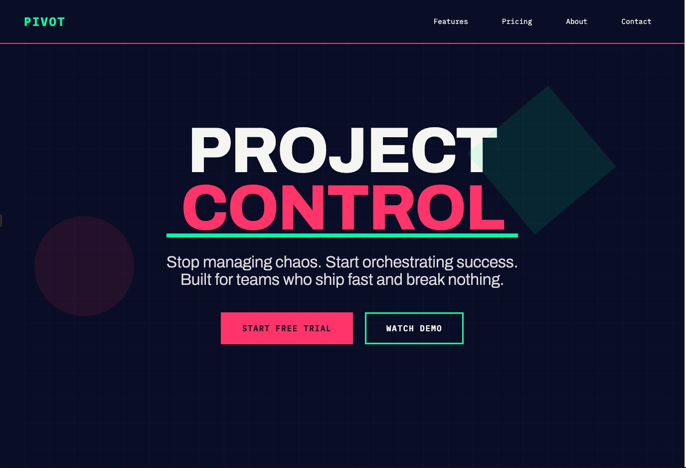
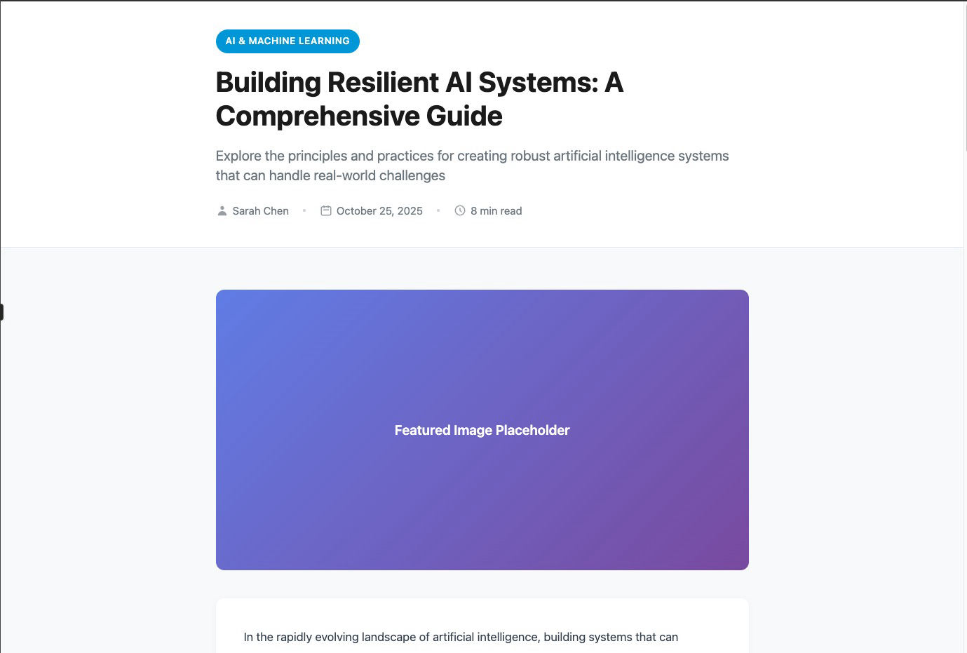
Example 1: SaaS Landing Page
Prompt: Create a SaaS landing page for a project management tool
Without Aesthetics Prompt:
View live artifact: [https://claude.ai/public/artifacts/5f736c0b-2d97-490f-af01-b547eac598ab]
With Aesthetics Prompt:
View live artifact: [https://claude.ai/public/artifacts/6622f59b-2d03-4db4-bdcb-6718d560b73d]
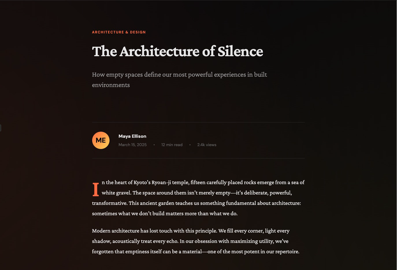
Example 2: Blog Post Layout
Prompt: Build a blog post layout with author bio, reading time, and related articles
Without Aesthetics Prompt:
View live artifact: [https://claude.ai/public/artifacts/c8f1cdca-c91d-43be-8f48-8337b6788e86]
With Aesthetics Prompt:
View live artifact: [https://claude.ai/public/artifacts/0629512a-df13-4f33-8771-81ec1438edc3]
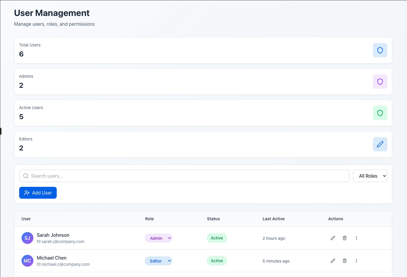
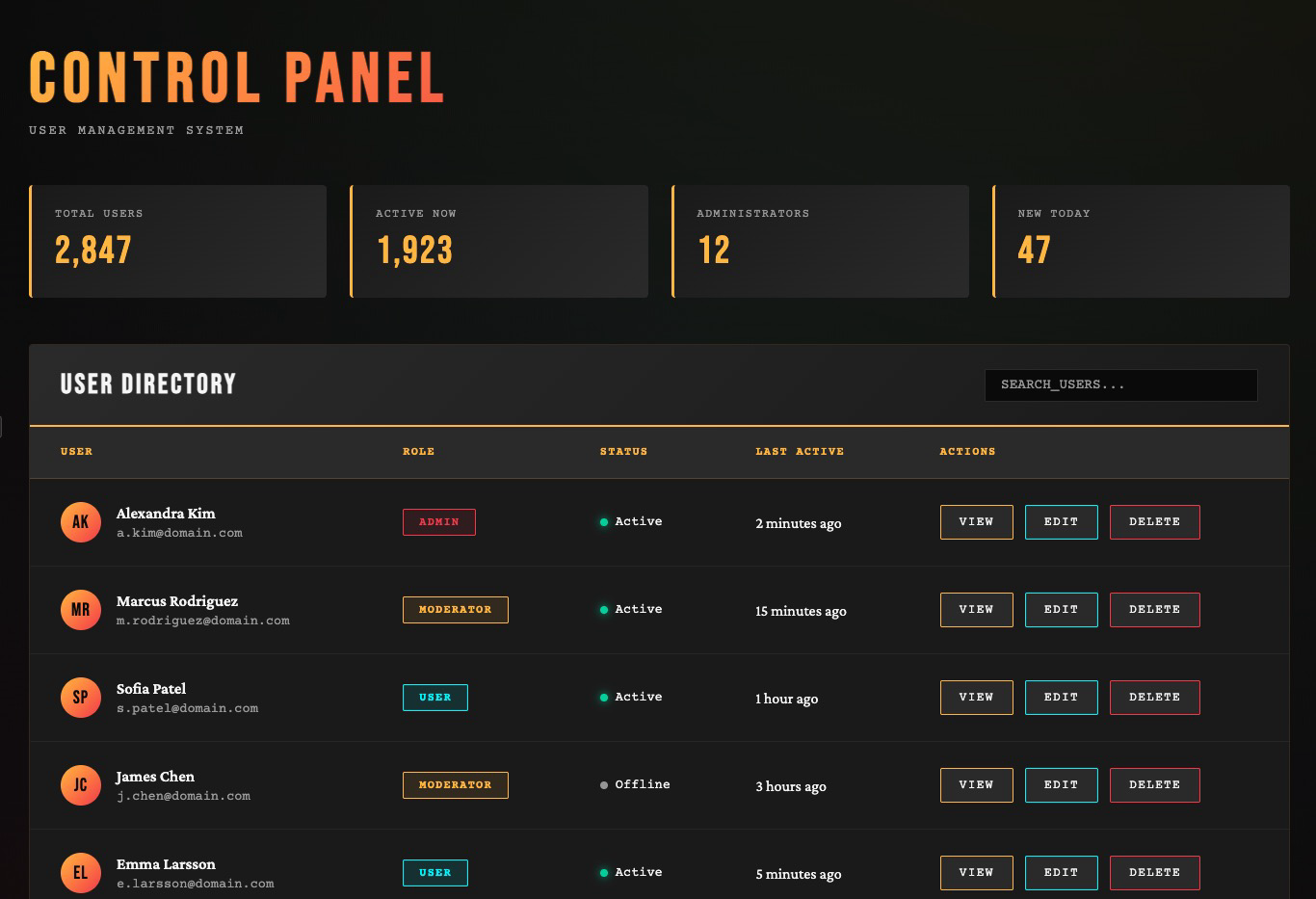
Example 3: Admin Dashboard
Prompt: Create an admin panel with a data table showing users, their roles, and action buttons
Without Aesthetics Prompt:
View live artifact: [https://claude.ai/public/artifacts/8c7f77a4-cd81-4158-ab43-c65add20522f]
With Aesthetics Prompt:
View live artifact: [https://claude.ai/public/artifacts/b7180d4f-e0dd-468e-a78f-a2c5ae419142]
For More Control: Isolated Prompting
When you want targeted control over a specific design dimension, the cookbook recommends isolating that constraint in its own prompt. Here’s their typography-focused example:
This approach works when you’re iterating on an existing design and want to fix one dimension without regenerating everything. You can create similar isolated prompts for color schemes, layouts, or animation patterns.
What Actually Works in Practice
I’ve tested this with multiple LLMs. Here’s what I’ve learned:
Claude Sonnet performs best on thoughtful design when given specific constraints. It’s better at reasoning about visual hierarchy and user experience than GPT-5 or Gemini. But it still falls into templates without strong prompts.
v0 (Vercel’s tool) consistently produces better-looking designs than Claude or Cursor for pure frontend generation. Why? Because v0 is specifically trained on shadcn/ui components and Tailwind patterns. It’s optimized for this narrow domain.
shadcn/ui + Tailwind are “AI-ready” because they have predictable, component-based structures. LLMs trained on these patterns can recombine them effectively. This is why v0 works well and why hand-rolled custom CSS often confuses models.
Assign roles and personas in your prompts. “You are a senior frontend engineer with 20+ years experience and a background in print design” produces different results than no preamble. It changes the probability distribution the model samples from.
Request multiple options. Ask for three different design directions. The model will explore more of the solution space instead of converging on the first local maximum (which is usually purple).
Lock in specific themes with XML tags. If you’re iterating on a design, wrap aesthetic constraints in tags:
This ensures the theme persists across multiple generations without drifting back to defaults.
The Reference-Driven Approach
The most reliable technique I’ve found: extract design references before prompting the LLM.
The workflow:
This approach works because you’re not asking the LLM to invent aesthetic taste. You’re asking it to apply patterns you’ve identified in existing designs.
The LLM becomes a translator: you describe what you want in design language, and it outputs the code.
The Deeper Problem
The purple gradient issue is a symptom of something more fundamental: LLMs don’t have taste.
Taste requires lived experience. A human designer develops taste by looking at thousands of designs, by feeling the emotional impact of a layout, by noticing which interfaces delight and which frustrate. This builds an internal model of “good” that’s hard to articulate but easy to recognize.
LLMs don’t have that internal model. They have statistical correlations between tokens. “Modern design” correlates with certain CSS patterns in their training data, so they reproduce those patterns. But correlation isn’t taste.
This is why the best AI-generated designs come from designers using AI as a tool. The designer provides taste, constraints, and judgment. The AI provides speed and execution.
If you’re not a designer, the best move is to steal taste from people who are. Find designs you like. Describe what makes them work. Give the LLM those constraints. Iterate.
You’re not asking the AI to be creative. You’re asking it to implement someone else’s creativity at scale.
A Quick Checklist when working with LLMs for frontend
Before you start:
In your prompt:
After generation:
Tools that help:
The Takeaway
LLMs generate code that looks like code should look. That’s their strength. But design isn’t just about syntax. It’s about taste, context, and user experience.
The purple gradient problem exists because we ask LLMs to fill in blanks we should be filling ourselves. When you say “build a landing page,” you’re asking the model to invent constraints. It can’t. So it chooses the statistical average, which is boring.
Give it constraints instead. Tell it what you want. Show it examples. Describe the aesthetic. Explicitly rule out the defaults.
The model can execute. You have to direct.
And maybe, if we’re lucky, we can kill the purple gradient once and for all.
Graph View
Table of Contents
Backlinks
Created with Quartz v4.4.0 © 2026
相關文章